
Download:
SVG, PNG
SVG, PNG
SVG, PNG
The Travelpayouts brand mark is a unique symbol that combines the letters "t" and "p." These letters are stylized in a way that forms a metaphor for journey and travel.
Logotype
Color Usage
Brand colors
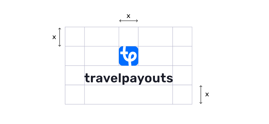
Clear Space (Vertical Version)
Font:
#1B1D29
#006DFF
Type color
To separate the logo from its surroundings, use clear space where no other elements should enter. The recommended width of the clear space should be at least the width of the symbol part.
Monochrome Logo (Light and Non-Blue-Compatible Backgrounds)
Used on light and non-blue-compatible backgrounds. (!) The logo must contrast with the background and remain easily readable.
Used on light and non-blue-compatible backgrounds. (!) The logo must contrast with the background and remain easily readable.
Monochrome Logo (Dark Backgrounds)
Used on dark backgrounds, BUT NOT in the dark theme. (!) The logo must contrast with the background and remain easily readable.
Used on dark backgrounds, BUT NOT in the dark theme. (!) The logo must contrast with the background and remain easily readable.
Primary Logo + White Text
Used in the dark theme of the product. This combination should be maintained to preserve user association with our logo.
Used in the dark theme of the product. This combination should be maintained to preserve user association with our logo.
Primary Logo
Used on light and blue-compatible backgrounds. (!) The logo must contrast with the background and remain easily readable.
Used on light and blue-compatible backgrounds. (!) The logo must contrast with the background and remain easily readable.
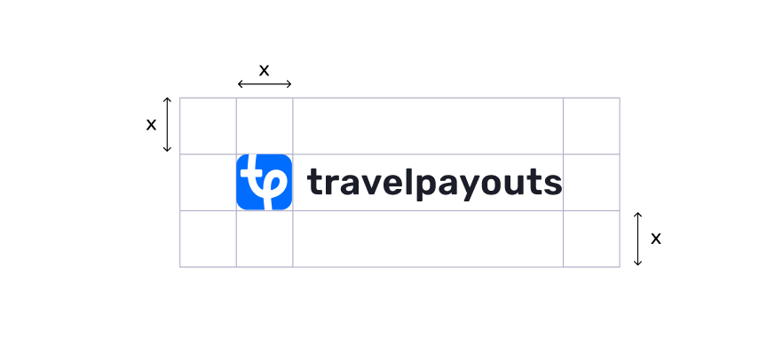
To separate the logo from its surroundings, use clear space where no other elements should enter. The recommended width of the clear space should be at least the width of the symbol part.
Clear Space (Horizontal Version)
Main color
weight Semibold, 1.5% letter spacing.
Download:
Download:
Download:





Download:
SVG, PNG
SVG, PNG
SVG, PNG
Download:


